 Have you ever visited a website that left you feeling frustrated? Maybe you were looking for something and couldn’t find it. Or you felt like you had fallen down a rabbit hole and didn’t know how to get back to where you started. Websites with poorly organized structures have this effect; they can leave you feeling disoriented and discouraged.
How does this happen – and how do you avoid it when managing or creating your own website?
When a new website is created, a lot of time and energy is invested in the platform (the code) and in the visual design – and that’s to be expected. Unfortunately, it’s often the case that the website structure – the “information architecture” gets far too little attention.
The term “information architecture” sounds complicated, but it’s actually pretty simple. As anyone who has (or is planning to have) a website knows, one of the first tasks is pulling together written content. Information architecture is the way that content is organized. And like building a house or office, the amount of planning that goes into the structure will make or break the end product.
When it comes to websites, the most basic site structure consists of a single Home page; the building equivalent of a single room. There are times when a one-page structure is suitable; a simple contact page. In most cases though, there is simply too much information – and different kinds of information – to post on a single page.
So, what’s the best way to organize this information in a way that will be intuitive and accessible?
First let’s take a second to consider what the terms “intuitive” and “accessible” mean when it comes to the Web. An intuitive website is one that doesn’t force you to constantly think “where am I?” By design, an intuitive site makes it easy to find what you’re looking for, without frustration or anxiety.
Accessible websites have been carefully designed to reduce barriers – often invisible barriers – that trip up humans and machines (like search engine robots, and assistive devices for persons with disabilities). A simple example is navigation tabs that don’t do anything; in the physical world, this would be like having a sign directing traffic to a place that doesn’t exist.
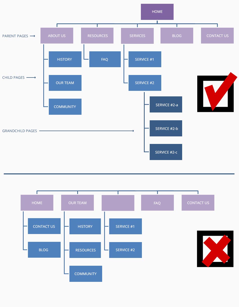
The trick to having a good website structure and information architecture is to spend some time with a pencil and paper. (Old fashioned, I know.) Use the example below as a guide for sketching out your ideal website structure.
Here are a few key things to keep in mind:
- Information has a flow, from general to specific;
- Visitors are going to follow that flow, so it’s important to decide where you want them to end up;
- If you want visitors to contact you for more information, your Contact page is where you want them to end up;
- If you’re selling a product, your product page is where you want to guide them;
- Information can – and should – be categorized; like a filing cabinet;
- Your Home page is the entrance to your filing cabinet;
- The ‘parent’ pages (your main navigation tabs) are the drawers in your filing cabinet;
- ‘Child’ pages (the navigation drop-down tabs) are the files inside the filing cabinet drawers;
- Navigation tabs should always have an associated page with accessible written content.
It’s never a bad idea to revisit your site structure and make adjustments to improve it. If you’re unsure how best to organize your website content, contact Black Cap Design for a consultation.