 Back in January I wrote a blog post called “Responsive Web Design – The Silver Bullet for Mobile Friendly Websites?” discussing the cost/benefit of responsive design.
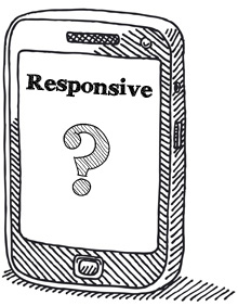
In case you’re not familiar with the term, responsive design involves designing and building a website that is capable of adapting to the screen size of the end user. Responsive websites will morph or shift to accommodate very large and very small screens.
Since writing that article we have completed several more responsive websites and have learned a thing or two. The first thing I learned is that the Internet Explorer Web browser continues to be the bane of existence for most Web Developers. A suggestion to you Internet Explorer die-hards out there: try Firefox, Google Chrome or Opera for just one week. They’re free and – in my opinion – they provide a faster more secure, intuitive and enjoyable browsing experience.
One of the responsive design projects we completed recently is for Mapleridge Recreation Centre. You can use this nifty tool to see how responsive design looks and behaves on a range of devices.
While there is no doubt that responsive design is a cool and powerful tool for hand-held computer users, it will continue to be finicky and imperfect for some time.
There is also the element of cost. There is a lot work involved in making a website design responsive, so expect the development cost to be about 25% more costly than a traditional fixed-width design.
So, my revised assessment: responsive design is certainly not going away and is worth considering if your visitor demographic is weighted toward hand-held users, and you don’t mind paying a bit more for it.
To talk about your options and what’s right for you, contact us at 705-927-2308 or send email to .